YAYA
オリジナルのマスクおよび関連商品の企画販売を行う会社「YAYA」。ロゴとパッケージのアートディレクション&デザインを担当いたしました。
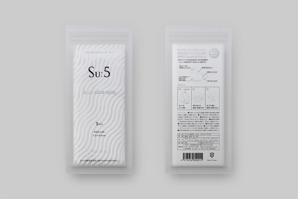
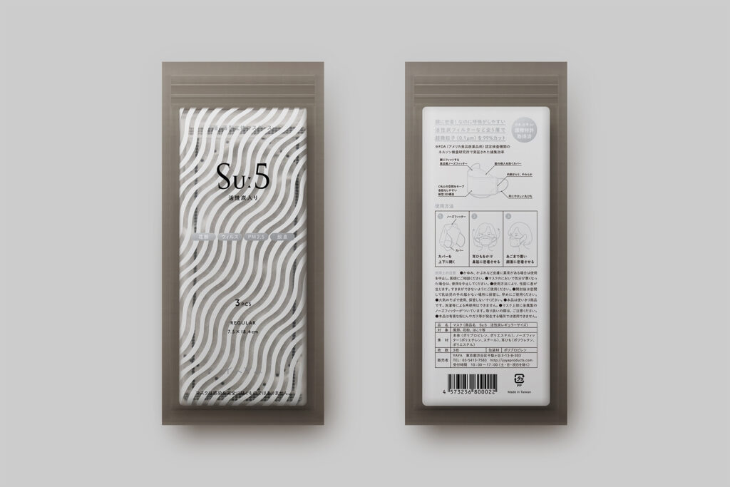
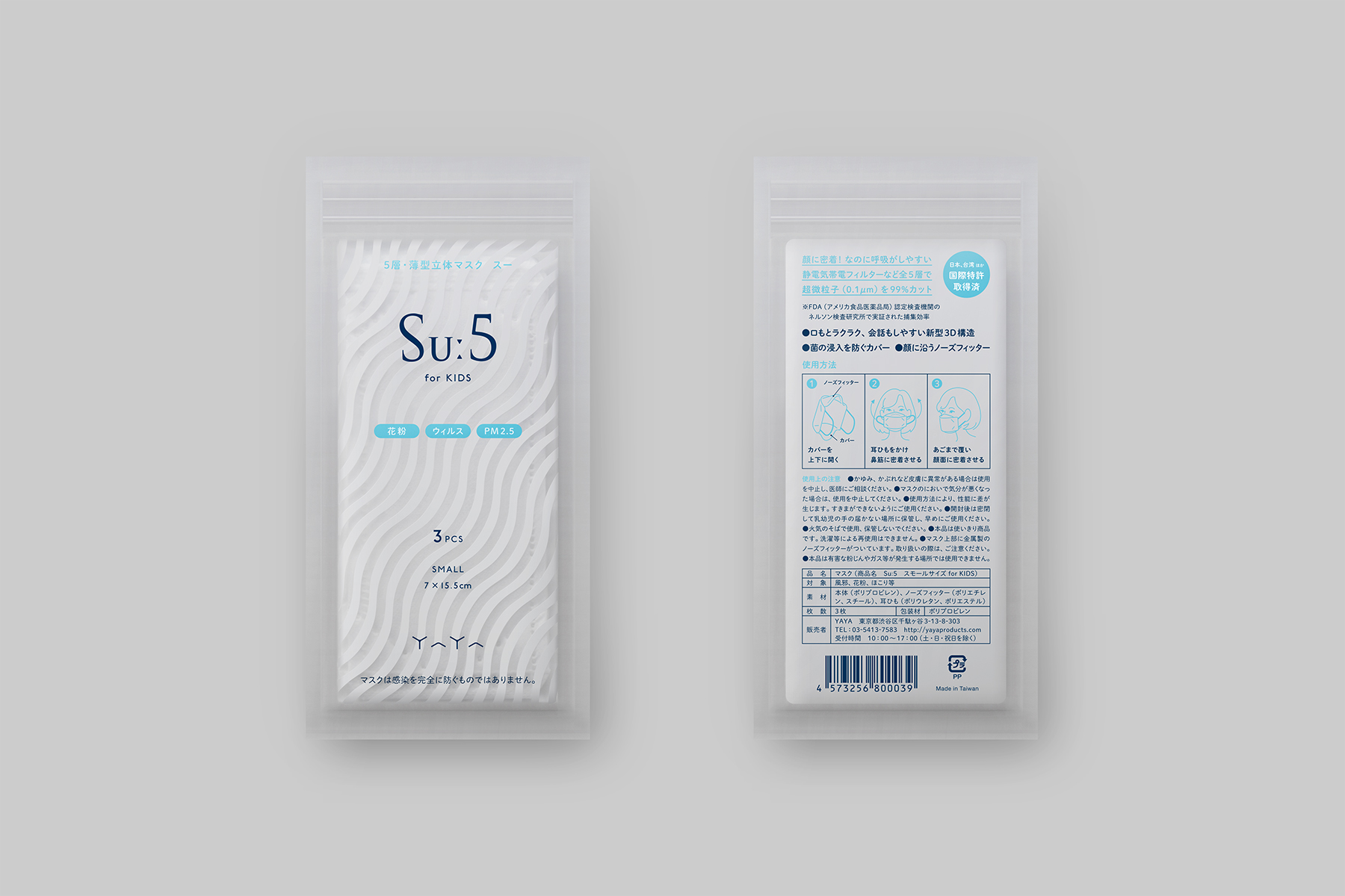
ロゴは、マスクを装着した際にできる美しくゆるやかな曲線から着想を得て山型のエレメントをつくり、それを8つ組み合わせてロゴタイプを制作しました。シンプルなモチーフを基に構成することで、上品かつ印象に残りやすい仕上がりに。縁起の良い数字とされる「8」には、同社の発展への願いを込めています。色はシルバーを選択し、洗練されたイメージと清潔感を表現しました。
パッケージは、ブランド名Suː5の頭文字「S」をモチーフにした波模様をパッケージ正面に大胆に使用し、商品の最大の特徴である「呼吸のしやすさ(すーすーする)」を表現しました。
This logo was designed for YAYA, a company that plans and sells original masks and other related products. Inspired by the beautiful and gentle curve that wraps around the face when their masks are worn, we first created a chevron element, then combined eight of the elements to form the logotype of YAYA. The goal was for the simplicity of the motif to convey elegance yet create a striking impression. Our hopes for the growth and prosperity of their company also lies within the use of eight chevron shapes; eight is considered to be a lucky number in Japan. We selected the color silver to visually express sophistication and cleanliness.
–
Client|YAYA
Year|2016
Art Direction & Design
池上 直樹(コトホギデザイン)
Copywriting
二階堂 薫
Illustration
Adrian Hogan
–
TOPAWARDS ASIA(January/2018)|受賞
日本タイポグラフィ年鑑 2016|入選