山川酒造2020.05.01
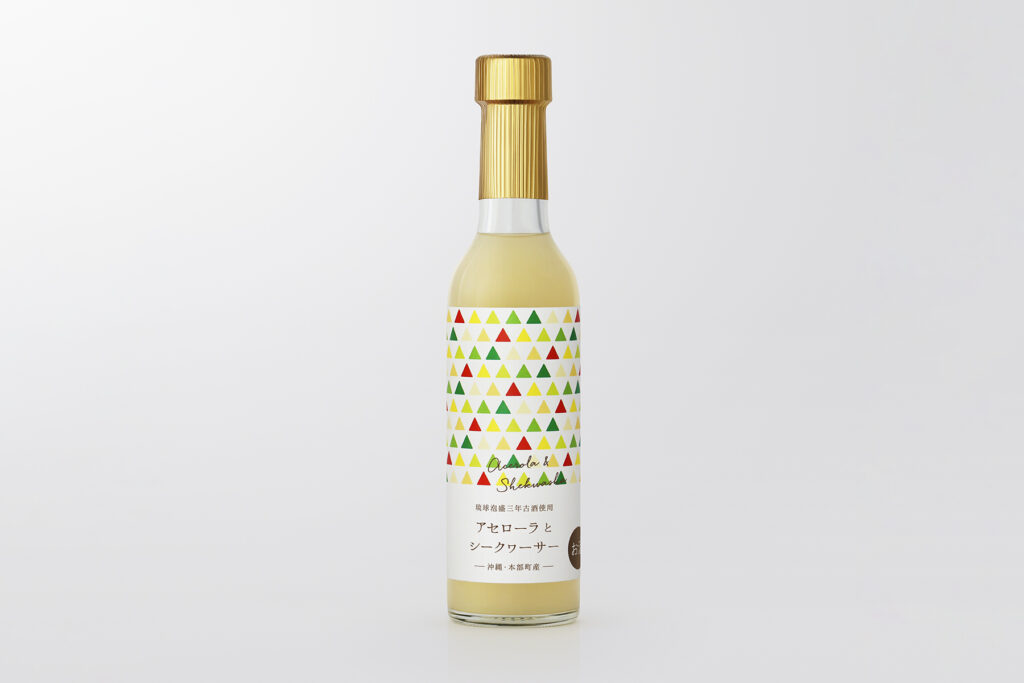
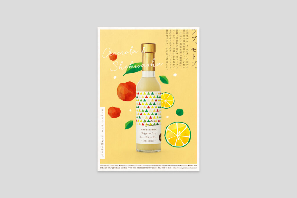
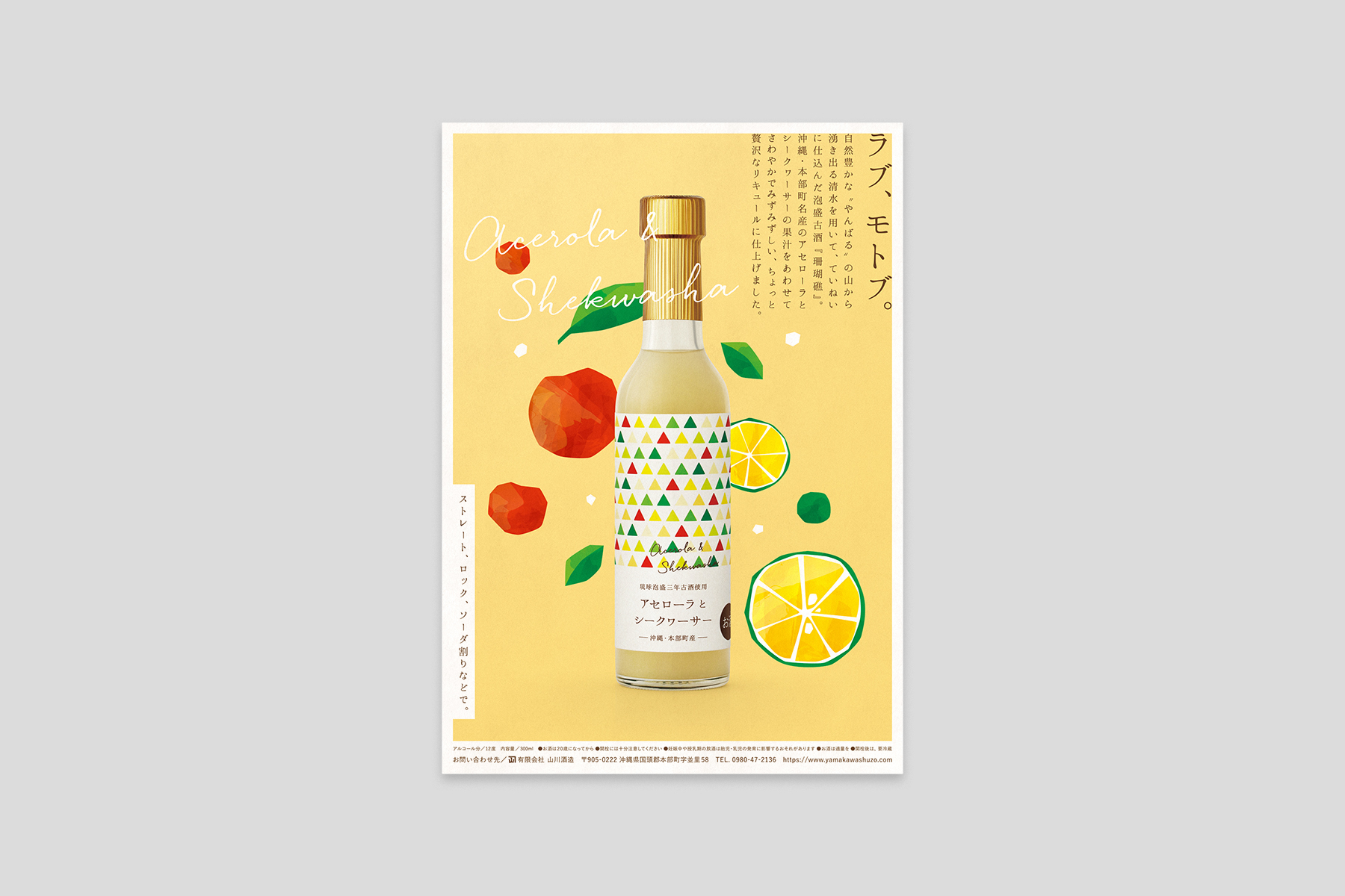
沖縄県国頭郡本部町にある泡盛酒造所「山川酒造」が新たにつくった、泡盛古酒を使用したリキュール『アセローラとシークヮーサー』。パッケージと販促用ビジュアルのアートディレクション&デザイン、コピーライティングを担当しました。
ラベルには、3個の正三角形からなる「山川酒造」の紋をモチーフに鱗形の模様をつくり、アセローラとシークヮーサーの実や葉からとった色を配置。泡盛になじみのない層にも気軽に楽しんでほしいという「山川酒造」の思いにもとづき、親しみやすくカラフルなデザインで、贈答品や土産物としても手に取りやすいパッケージを目指しました。
販促用ビジュアルは、泡盛古酒をより幅広い層に楽しんでもらいたいという思いのもと、同じ本部町の名産品であるアセローラとシークヮーサーを加えてつくられたリキュール。そのコンセプトと、フレッシュな風味を陽気なトーンのイラストやコピーで表現し、親しみやすいデザインに仕上げました。
This package was designed for a new liqueur brand made with aged awamori named “Acerola & Shekwasha,” produced by Yamakawa Shuzo; a distillery located in Motobu, Okinawa prefecture. We created the triangular pattern with a motif of three equilateral triangles, which is the crest of Yamakawa Shuzo, and arranged the colors of fruits and leaves of acerola fruit and shekwasha citrus. In response to their hope that people unfamiliar with awamori could enjoy the liqueur, we aimed to design a colorful and friendly package that makes the product approachable even as gifts or souvenirs.
We led the direction, design, and copywriting of this flyer for “Acerola & Shekwasha,” a new liqueur brand produced by Yamakawa Shuzo; a distillery located in Motobu, Okinawa prefecture. With hopes that a wider range of people will enjoy their aged awamori, Yamakawa Shuzo produced the liqueur by adding acerola fruit and shekwasha citrus, which are also local specialties of Motobu. To visualize their concept and the fruity taste of the liqueur through the flyer, we created an illustration and copy that has a pleasant tone, then completed the flyer with a friendly design.
–
Client|山川酒造
Year|2020
Art Direction & Design
池上 直樹(コトホギデザイン)
Copy Writing
小島 奈緒子
Illustration
サタケシュンスケ