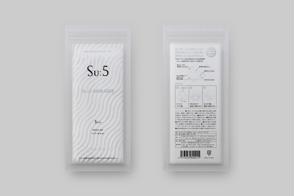
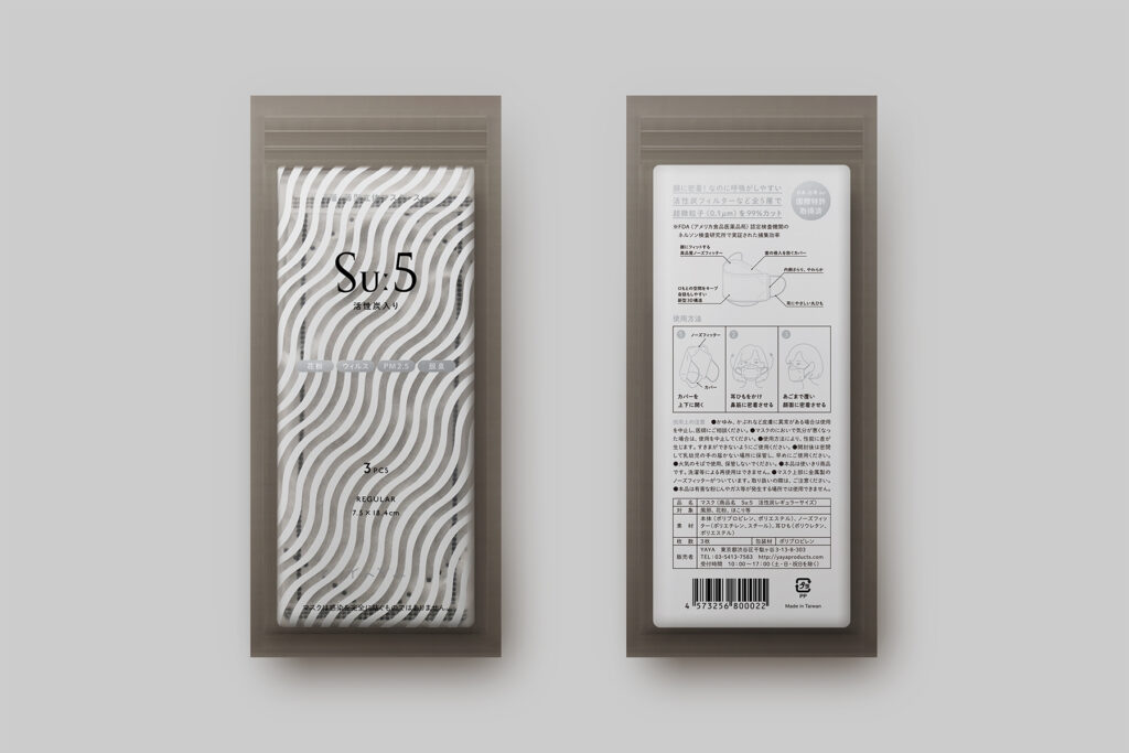
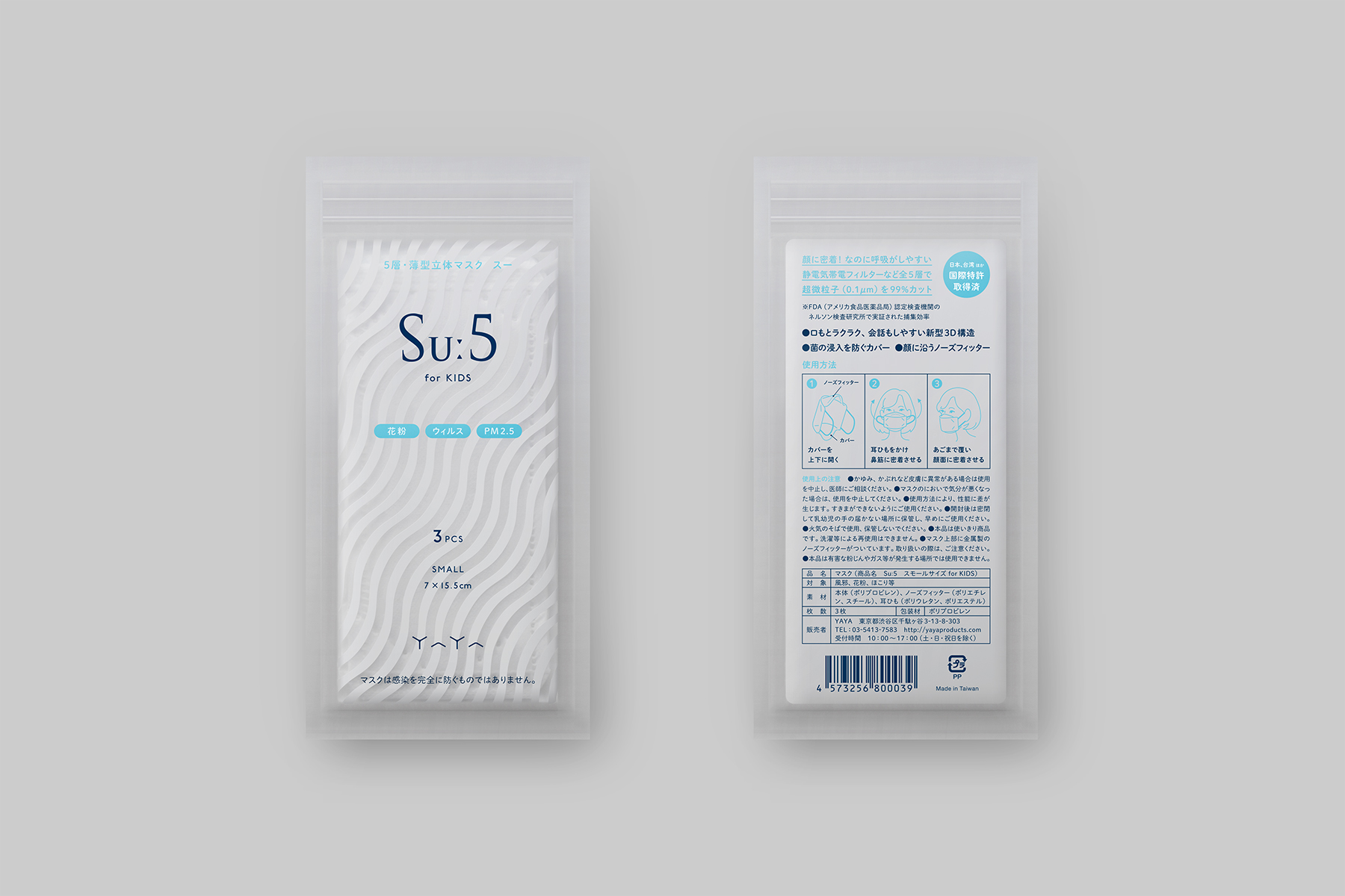
This logo was designed for YAYA, a company that plans and sells original masks and other related products. Inspired by the beautiful and gentle curve that wraps around the face when their masks are worn, we first created a chevron element, then combined eight of the elements to form the logotype of YAYA. The goal was for the simplicity of the motif to convey elegance yet create a striking impression. Our hopes for the growth and prosperity of their company also lies within the use of eight chevron shapes; eight is considered to be a lucky number in Japan. We selected the color silver to visually express sophistication and cleanliness.
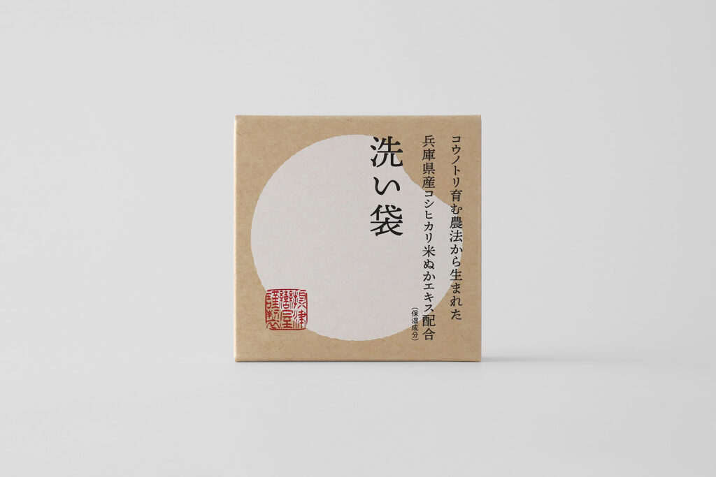
Visual identity for a textile brand making various products with fabric of Ishikawa prefecture in Japan. The logotype is composed of simple and flat lines in case that it is woven. A circular design of “o” at the center, which is the brand identity, is not precise circle shaped so that it expresses softness and warmth.
–
Client|iro
Year|2013
Art Direction & Design
池上 直樹(コトホギデザイン)
–
東京ADC賞 2014|入選
東京TDC賞 2014|入選
Graphic Design in Japan 2014|入選
日本タイポグラフィ年鑑 2014|入選